Comment with Kindness
• Updated
World Kindness Day is an annual international observance on November 13. For the last 4 years, TypeCampus organized a Fight for Kindness typographic poster exhibition. I participated for the first time this year.

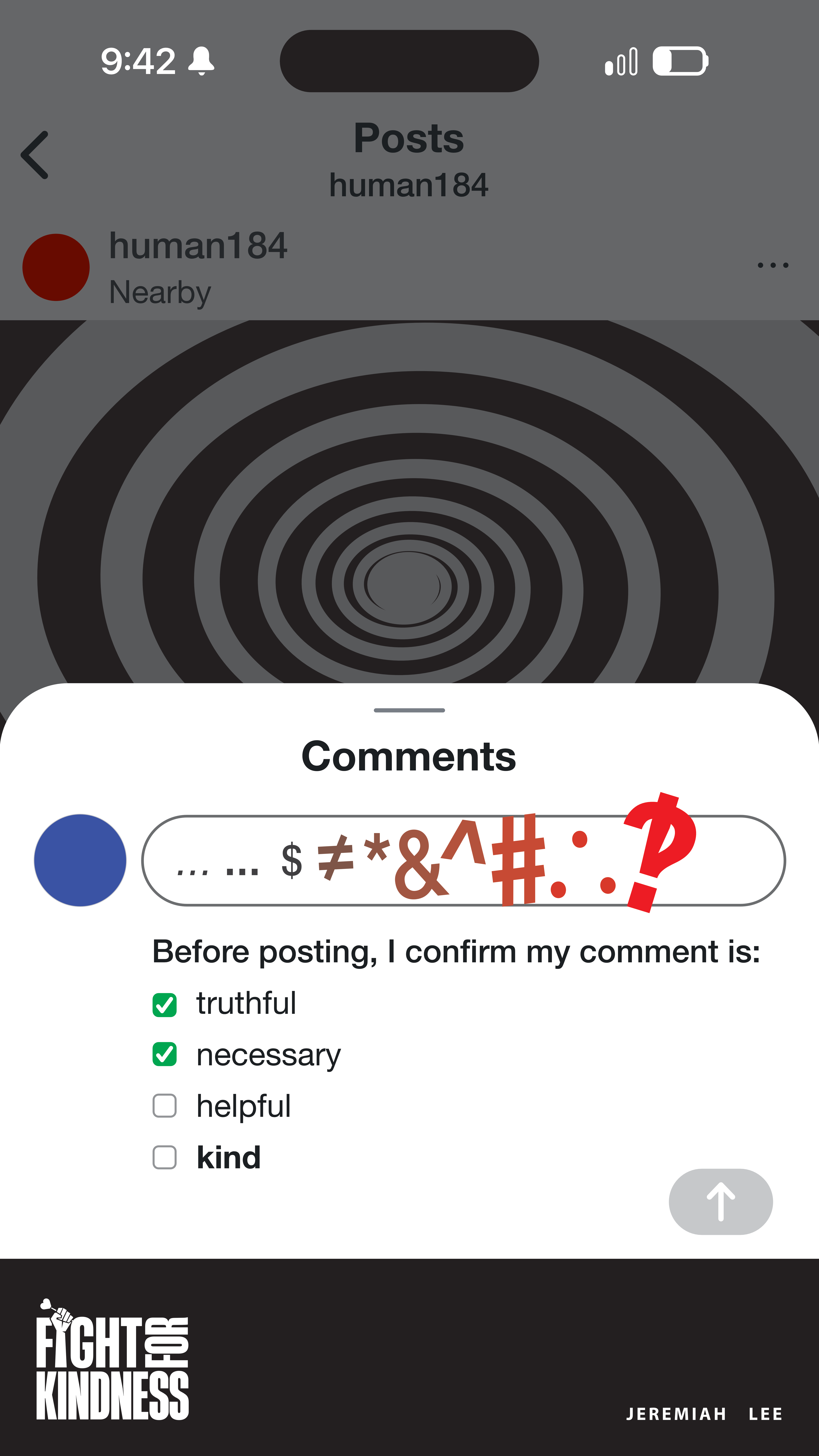
“Comment with Kindness” is based on one of my user interface experiments to promote more affirming interactions with other people in digital spaces. Today’s dominant social networks were designed to maximize advertising impressions even when the increased interactions become harmful to the people engaging. I often close the apps with a feeling of regret for opening them.
New social web technology standards give us the opportunity to create new social networks that prioritize healthy human engagement. User interfaces guide human behaviors. While reducing cognitive effort to accomplish a task often is desirable, increasing friction can be useful for slowing people down when their speed of interaction could be unsafe. We can use design to increase the intentionality of sharing online. Engagement does not need to be the key performance indicator of a social network when the social network is operated by small communities instead of a public company’s profit motive. If we succeed, I believe kindness will differentiate the next great social network.
If you like my poster design, I would appreciate your tap on the ❤️ in the upper left corner in the online exhibition.
Materials
Designed using Affinity Designer.
Fonts: Helvetica Neue, SF Display Pro to imitate the design of Instagram on iOS
Symbolism
Profile icons being red and blue, representing politically dividing colors.
Hypnotic spiral representing how social media algorithms pull us into their engagement control.
Weak cellular signal icon for our weak human connection.
Low battery icon for our energy being low.
9:42 is Apple’s famous time.
Grawlix translation
- $
- What you posted
- ≠
- is not
- *
- whatever
- &
- and
- ^
- furthermore
- #
- yada yada
- ∴
- therefore
- ‽
- WTF